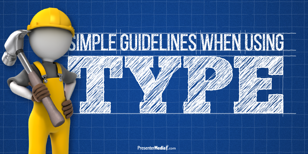
When designing a presentation, the use of typography can be confusing -- What font should I use? What size should my font be? Should I use more than one font? We have all been there before. Here are some simple guidelines when using type. These guidelines should help you get a jumpstart on creating an eye-catching, readable presentation.
- Avoid the Default fonts
Don't just settle with the default font that the software loads. Learn to install custom fonts on your machine (tutorial on it’s way). Each font has a personality and by using a different font it helps give your presentation character. There is a word of caution: stay away from cliche/ugly font. A simple
Google search will help you with figuring out what I'm talking about. If you are looking for a good resource for fonts check out
Google’s Font Library.
[Tweet "Get away from default fonts and give your presentation character."]
- Two Fonts Max
I know, I know, I just opened you up to a whole new world with the first rule. Using more than 3 fonts can make your presentation busy or even hard to read. Pick a font for the headlines and a font for the content. Most fonts come with a couple of variations, which are perfectly fine to mix-up in the presentation. Sticking with two fonts will help your presentation look professional and really stand out.
[Tweet "Give better readability to your presentation by using 3 fonts or less."]
- Planning
Hopefully, you're not just planning on cramming a bunch of text on one slide and calling it good. Plan out your presentation design and use
high-quality images, videos, and graphics with your copy. We have a huge library here at PresenterMedia, that is updated daily, full of
images and
videos that you can use alongside your text. We also have hundreds of
PowerPoint templates that can get you started in the right direction with your presentation.
[Tweet "Give objects and text a reason. Don't just randomly place them."]
- Attention to Readability
Just because you can read something doesn't mean that it’s easy to read. Depending on the size of screen you will be presenting on, you need to make sure your audience can read everything clearly and without straining. A couple of things to keep in mind is
line length,
line spacing (also known as leading), and overall font size. You want to make sure that person in the back row can read the text just as well as the person in the front row.
[Tweet "Make sure everyone in the room can read what is on the screen."]
By paying attention to the font you use, how many are in your presentation, the placement, and the readability, you should have an eye-catching, readable presentation. Now go forth and create!
What is your font of choice when designing a presentation?