Up to 50% OFF
What Can I Customize?
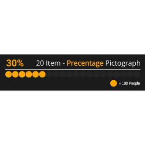
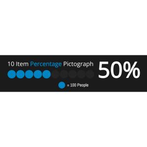
A pictograph is a simple data visualization that uses repeated icons to represent quantities. PresenterMedia pictographs are fully editable graphics you can customize online and download as high-quality images for slides, documents, or the web.
Open the online editor to edit values, labels, and text. Choose your icon style, adjust colors or layout, and when finished, click the Build and Download button to generate your customized image.
Yes. Select an icon set and click Edit. Under the Format Pictograph panel, use the paintbrush tool to adjust icon colors. You can also control how many icons are filled to reflect your values.
Absolutely. Update the quantities, click Update, and the pictograph will instantly adjust to match your changes.
Your customized pictograph downloads as a high-resolution PNG images. Perfect for use in presentations, documents, websites, or print.
Yes. Simply insert the PNG image into any slide like a regular picture. It scales cleanly and displays exactly as designed.
A limited selection is available for free. Full access to all pictographs and advanced customization features is included with a PresenterMedia Unlimited Plan Subscription.
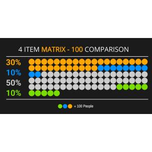
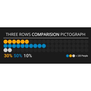
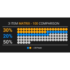
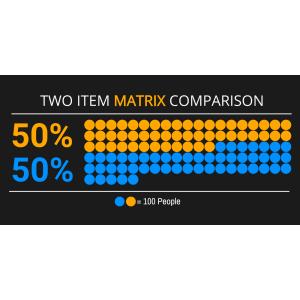
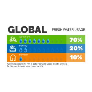
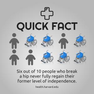
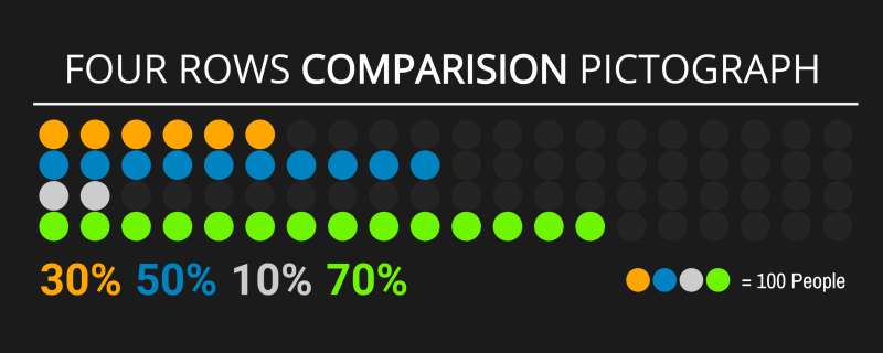
This editable pictograph displays four rows of circular icons, with each row having a different combination of colored and grey icons. Below the rows are percentages: 30%, 50%, 10%, and 70% respectively, indicating a quantitative comparison among the four categories represented by each row.
Hello! By clicking on the 'Customize This Item' button above, you can personalize this pictograph to fit your needs perfectly. You have options like changing text labels, adding images that resonate with your audience, deleting unnecessary elements for clarity, or diving into the pictograph editor to swap out icons and adjust their sizes as well as reorganizing the layout entirely!
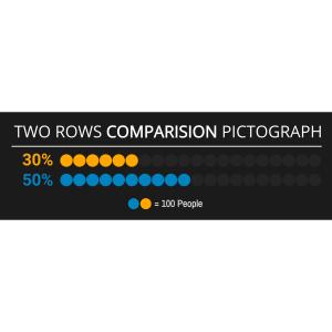
This Four Row Comparison pictograph can represent various comparative data sets in a visually engaging manner. It simplifies complex information into an easily digestible format, allowing for quick analysis at a glance. The differing colors and associated percentages delineate separate data groups or categories. This type of visualization is particularly effective in highlighting disparities or emphasizing progress across different segments.
Adding this clipart image to a slide in one of our PowerPoint templates can create a visual focal point to accompany the presentation slide message. It helps in breaking down complex data into easily understandable visuals. This can enhance audience engagement and retention of information.
This image's transparent PNG background makes it highly versatile for media design projects. By clicking the background layer's visibility in the layers tab, designers can seamlessly integrate this pictograph into various layouts without any background clash. This feature allows for clean overlays on diverse backgrounds, enhancing the professional appeal of any media project.
You can find many more standout Pictographs for visual aids. These pictographs are designed to make your presentations more impactful. They provide a variety of options to suit different presentation needs and styles.
pictograph four row categories data distribution comparison datasets percentage graph chart statistics
Similar Templates and Designs
© 2009-2025 Eclipse Digital Imaging, Inc.
Quality PowerPoint Templates, Animations, videos, and 3D Clipart.
PowerPoint® is a registered trademark
of Microsoft Corporation.