Up to 50% OFF
What Can I Customize?
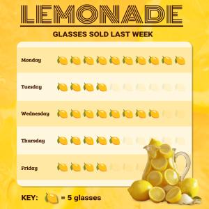
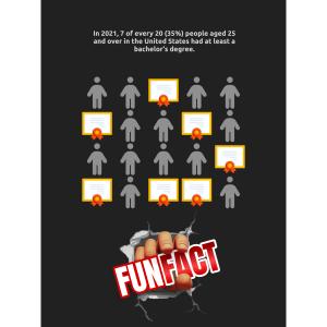
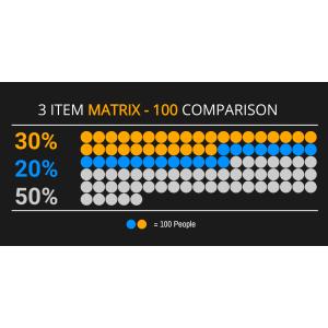
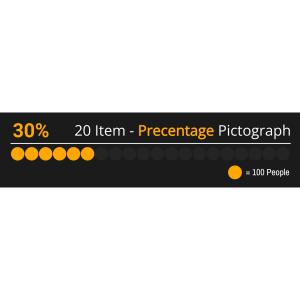
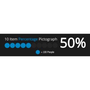
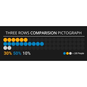
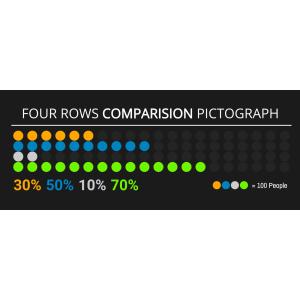
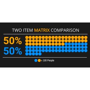
A pictograph is a simple data visualization that uses repeated icons to represent quantities. PresenterMedia pictographs are fully editable graphics you can customize online and download as high-quality images for slides, documents, or the web.
Open the online editor to edit values, labels, and text. Choose your icon style, adjust colors or layout, and when finished, click the Build and Download button to generate your customized image.
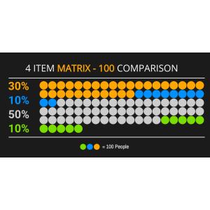
Yes. Select an icon set and click Edit. Under the Format Pictograph panel, use the paintbrush tool to adjust icon colors. You can also control how many icons are filled to reflect your values.
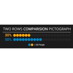
Absolutely. Update the quantities, click Update, and the pictograph will instantly adjust to match your changes.
Your customized pictograph downloads as a high-resolution PNG images. Perfect for use in presentations, documents, websites, or print.
Yes. Simply insert the PNG image into any slide like a regular picture. It scales cleanly and displays exactly as designed.
A limited selection is available for free. Full access to all pictographs and advanced customization features is included with a PresenterMedia Unlimited Plan Subscription.
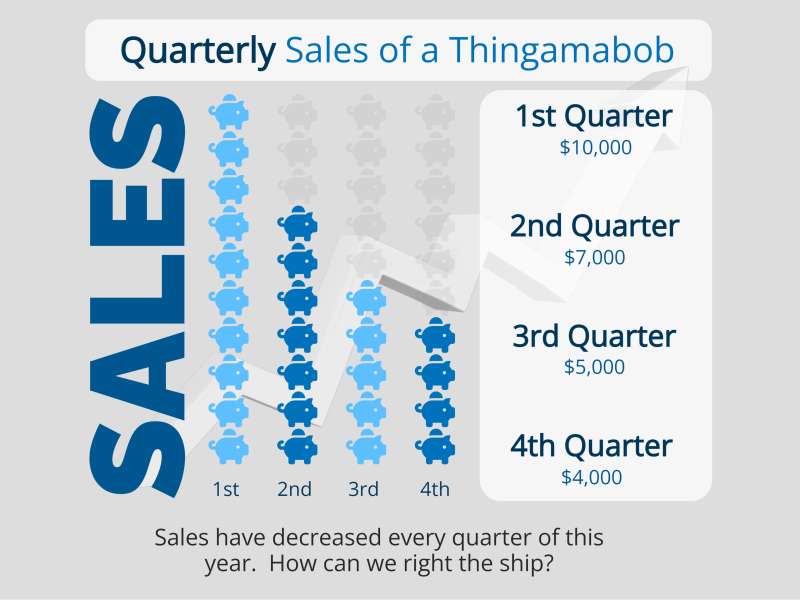
This editable pictograph displays four horizontal bars, each representing a quarter, with icons of a 'thingamabob' or your product name to visualize sales data. Each bar is labeled from '1st Quarter' to '4th Quarter' with sales figures ranging from $10,000 to $4,000.
By clicking on the 'Customize This Item' button above, you can personalize this pictograph to fit your needs perfectly. You can change the text, add an image, delete elements, or access the pictograph editor to change the icons, increase/decrease icons, and change the layout. This customization feature allows you to tailor the pictograph to represent your data better and make it more relevant to your audience.
This pictograph provides a visual representation of sales data over time. It allows for an immediate understanding of trends and comparisons between different periods within the fiscal year.
In business and finance, this image represents a declining trend in quarterly sales for a product named 'Thingamabob' or whatever your product name is. The highest sales are recorded in the first quarter at $10,000, decreasing steadily to $4,000 by the fourth quarter. This visualization can prompt discussions on market strategy adjustments or product performance analysis. It may also reflect seasonal demand or highlight the need for promotional efforts during lower-performing quarters. Such graphical representations are crucial for stakeholders to make informed decisions based on precise data trends.
Adding this clipart image to a slide in one of our PowerPoint templates can create a visual focal point to accompany the presentation slide message. It helps make the data more engaging and easier to understand, which can be particularly useful in highlighting critical points during a presentation.
This image's transparent PNG background makes it versatile for various media design projects. By clicking the background layer's visibility in the layers tab, designers can seamlessly integrate this pictograph into different backgrounds or textures without any unsightly borders. This flexibility is essential when creating professional-looking designs that require elements that blend well with other components.
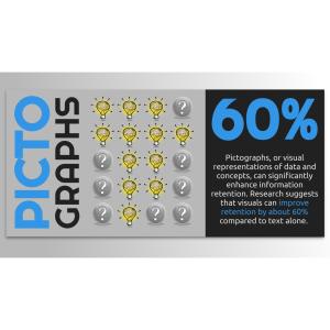
You can find many more standout Pictographs for visual aids. These pictographs can enhance your presentations by providing clear and visually appealing data representations. They are designed to make complex information more accessible and engaging for your audience.
pictograph sales data pictograph trends comparisons fiscal year
Similar Templates and Designs
© 2009-2025 Eclipse Digital Imaging, Inc.
Quality PowerPoint Templates, Animations, videos, and 3D Clipart.
PowerPoint® is a registered trademark
of Microsoft Corporation.